Direct Mail
"You gotta grab 'em, make 'em feel and understand before they toss it in the trash."
I learned to make great websites by making direct mail.
Before I worked full-time as a political direct mail (and general strategy) consultant, I thought I knew what made good design and copy. And I think it's fair to say that I had a pretty good idea. But being knee-deep in direct mail, laying out and writing 10+ pieces of mail a day, I really learned what made memorable and actionable communications: the ability to create an immediate emotional connection and compel action.
The Internet is no different. Like a stack of mail, a website offers users a multitude of things vying for their attention.
Enter anything into a Google search, and immediately, thousands of options are just a click away. This means that content needs to be strategic, uses the right keywords, and is laid out with appropriate headers to rank well on a search engine result page.
When users arrive on a site, they aren’t going to read it top to bottom, page by page; instead, they are likely to skim a page, and if it doesn’t connect with them immediately or make it easy to do the task they want, they're going to leave. They have options. Lots of options. Just like they have the next piece of mail in their stack to sort through.
See, it's not that different.
Direct Mail Process
The process of conceptualizing and writing direct mail differs from that of a website only in the technical-build aspects. The actual strategic conceptualizing and writing process are very similar to that of initializing working through a web build:
DISCOVERY
Depending upon the size of the race and the client's budget, research approaches differ; they can include:
- Candidate research
- Consulting team input
- Competitive analysis/opposition research
- Past district performance
- Voter statistics
- Polling data
- Focus groups
PLANNING
Armed with the information from the discovery phase, it is time to plan a communications strategy. For larger races, this means coordinating with a variety of other communications consultants to create a comprehensive strategy that seamlessly conveys the candidate's message. This process includes weighing the benefits of different mail sizes with the number of pieces in a plan and the size of the target audience. Then the message is layered with other communication efforts to amplify the effect.
LAYOUT
After a mail plan is approved, each piece needs to be laid out, photos either selected or planned for and content written. Over the years, I have wireframed a significant number of mail pieces of various sizes, cuts, and folds. Each piece’s layout accounted for the images and content.
PRODUCTION
Just like a website, you can’t create a mail piece in a vacuum; like on a website build, you have to determine the feasibility and timing of each piece.
Case Studies
The two pieces below were designed for municipal-level elections in Albuquerque, NM. Much of these candidates’ target audiences overlapped. The pieces were the very popular standard mail size of 8.5x11. They were set to arrive at households along with a deluge of other mail, so they had to stand out, be memorable. Voters don't sit down and read political direct mail cover to cover. They skim and sort as they walk from their mailbox to their trashcan (or recycling bin).
Matt Biggs for City Council

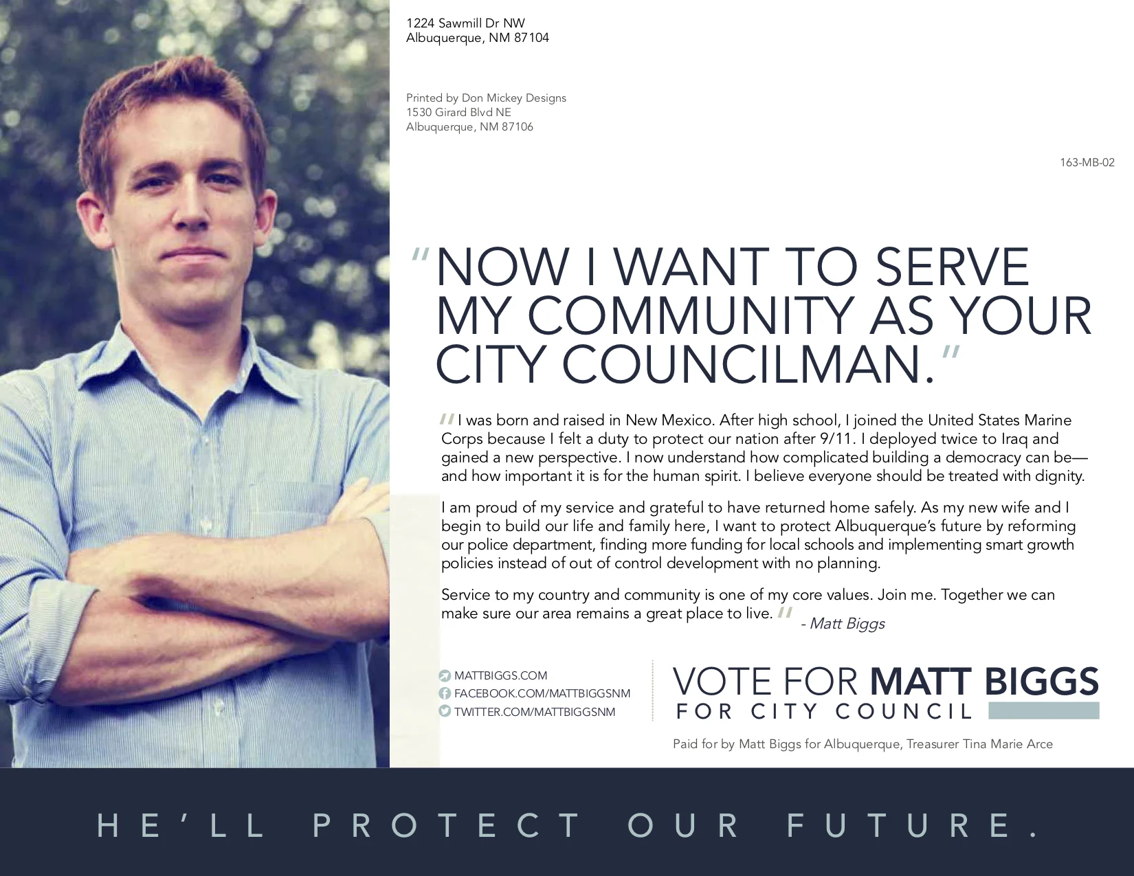
Matt Biggs was a political outsider in a three-way race against two very well known and respected female candidates. He had a great story to tell but very little money to tell it.
We were able to run a small direct mail program for Matt that included three 8.5x11 mailers. We focused heavily on telling his story and providing an optimistic voice for the district. The piece above is the first piece of mail we ran. It was a showstopper. And it was strategic. We needed it to be show legitimacy. Generate buzz. We mailed it slightly earlier than we normally would have to generate conversation and volunteers. It worked.
Matt went from being a political unknown to recognized at the gas station. People started calling his house to get involved, knock on doors, talk to their friends and family. He had to pick up his printing overages to keep literature in people's hands so they could walk door to door!
For this piece, I used:
- An emotionally compelling picture that immediately conveyed Matt's values
- Bold headlines in the first person to create a connection with voters
- A callout that interrupted the cover image, drawing attention to the office he was running for
- An easily scannable back with more information about the candidate
- Copy that gave voters (if they read it) a deeper sense of Matt's community roots and vision for the future
Though Matt didn't quite make it in this election, he went from being a political unknown to later being asked to run for another office (which he won).
Courtney Weaks for Metro Court Division IV


Judicial races are tough.
No one knows who any of the candidates are, and because they are nonpartisan races, the ballot offers no clues as to how well a candidate aligns with your personal values. Judicial candidates have a notoriously difficult time fundraising, which means they often have very little money to spend communicating with voters.
Courtney was able to run four pieces of direct mail. The first three were smaller than 8.5x11, and I often worry that such smaller pieces are even more likely to get lost in the mail. The piece above was the last piece of mail sent before the election. More than anything, voters want judges who are qualified, so I needed to summarize her credentials in a way that was memorable to voters and they could quickly see that she was qualified.
For the cover, I picked a stock picture that I absolutely love. It's so memorable. We slapped a headline on it that immediately connected with voters along with the “qualified” badge with her endorsement. For the back, I again utilized the “qualified badge” with an endorsement and created heading levels that quickly conveyed her qualifications. Also, a picture with a corgi is always memorable.